It’s a new year, and it looks like warm hues are on the rise! It’s always exciting to see new inspiration in home interiors, and the colors this year feel both invigorating and familiar. Pantone, the color institute as well as Benjamin Moore, and Sherwin Williams paint companies have all selected warm red hues as their color predictions for 2023. We’ve noticed this in fabrics and fashion for some time, but the warmer tones are becoming more prominent in home interiors, and it’s exciting. There is increasing emphasis on how interior decorating affects mental health and color plays an important role in that. Color moves us. Color can set a mood, and create a conversation. The website colorpsychology.org puts it this way: “It can excite or soothe your mood, raise or lower your blood pressure, and even whet your appetite! Whether it’s innate or learned, it’s undeniable that color has a vital impact on how we go about our lives.” Let’s explore these hot new colors together!
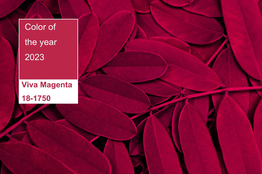
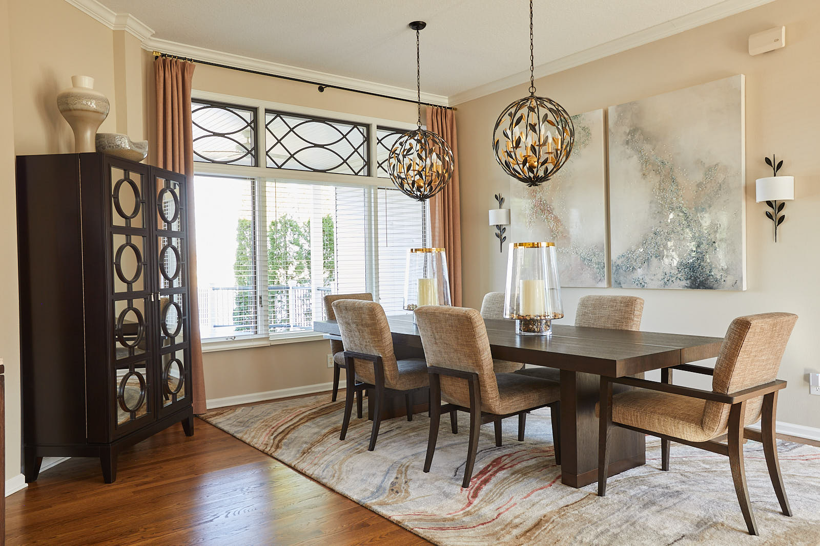
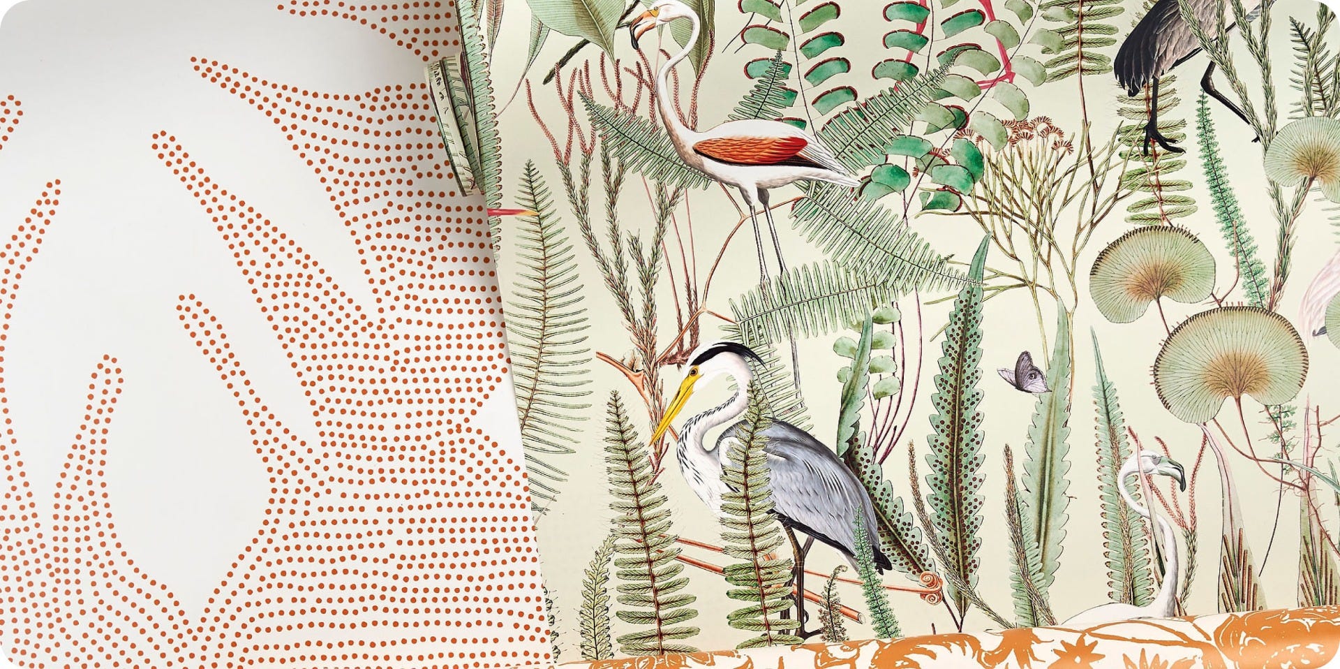
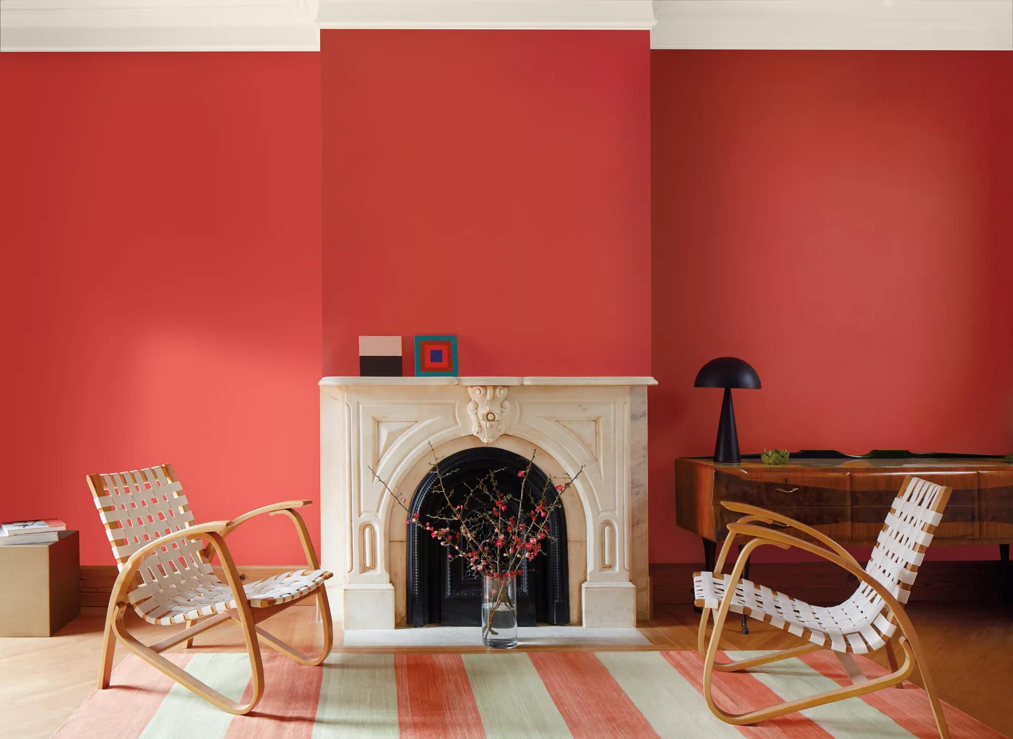
This luscious pink leaning red “vibrates with vim and vigor”- Pantone. It is a classic nature color found on red roses or berries, and yet it is a refreshing use of a color that we haven’t seen for a while in home interiors. It’s boldly vibrant and when used in large amounts commands attention, but when used in smaller touches becomes a striking accent. Imagine this color in a black and white room, how dramatic it would be! Conversely, this color would also fit right in as an accent color with warm sand, and soft sage as seen in the wallpapers below.
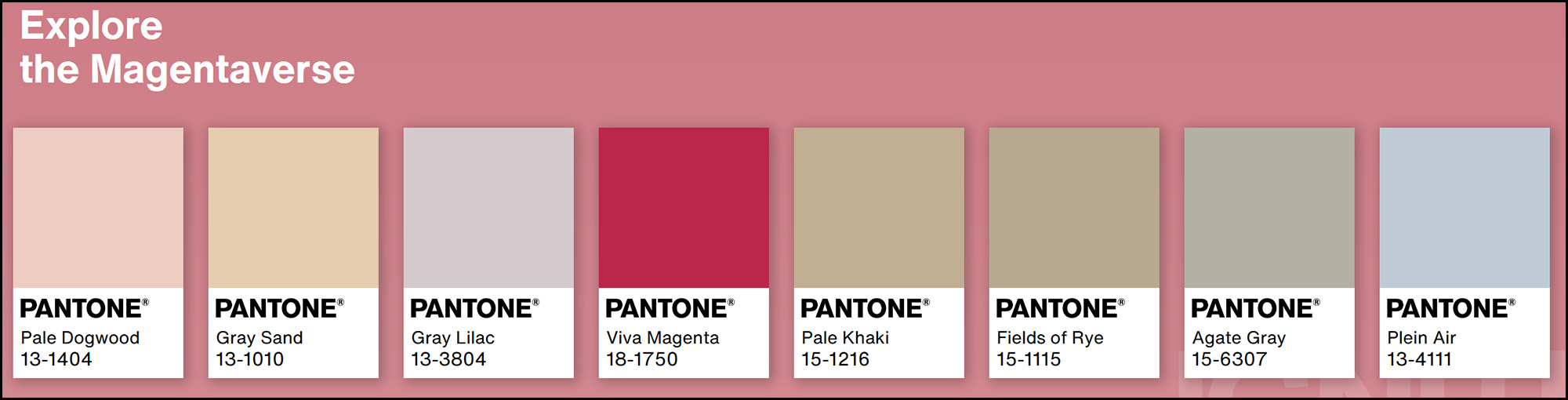
In Pantone’s color palette the “Magentaverse” you can see they’ve selected muted blush, sage, grey, and a soft powder blue to compliment the boldness of the rich ruby hue. This palette could easily be a quiet French country inspired cottage, or even a modern craftsman home palette.
Raspberry Blush 2008-30 is a very similar red to Viva Magenta, but brighter and more orange. “Never a backdrop, Raspberry Blush is the definition of charismatic color. This unapologetic shade of red orange had us thinking: bold, bolder, boldest.” – Benjamin Moore
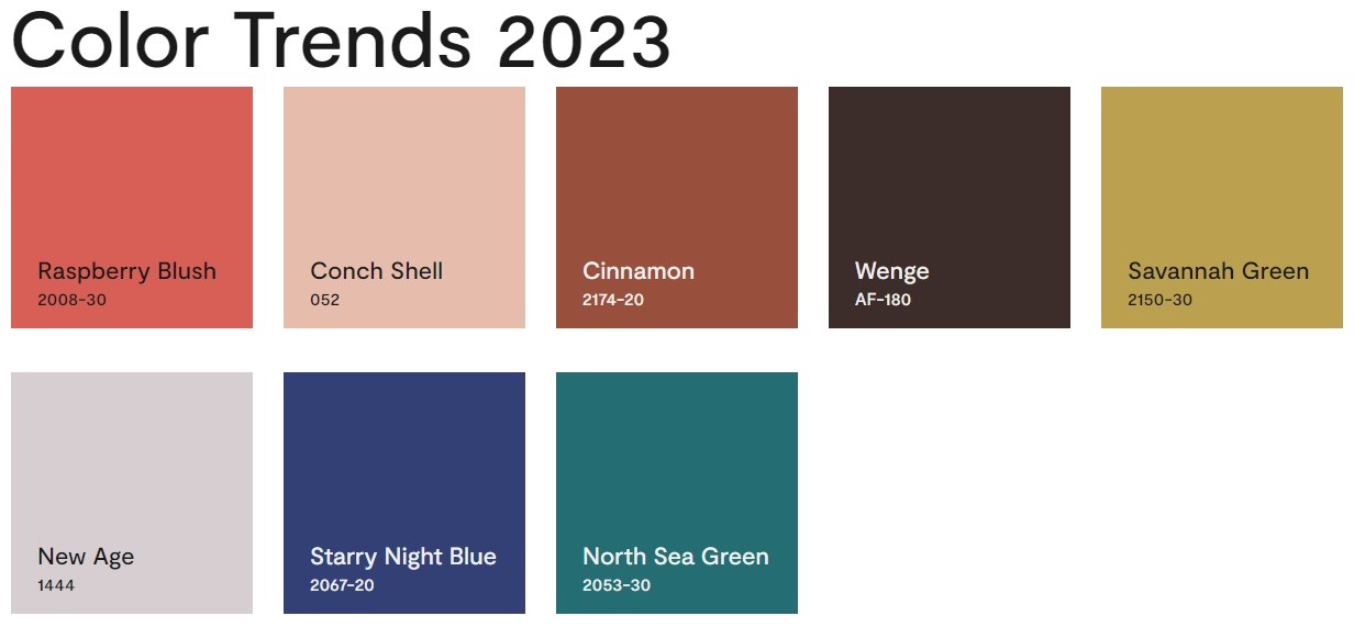
And it’s definitely bold, especially when paired with the other rich hues Benjamin Moore selected for their 2023 color palette. Raspberry Blush is bold enough to balance the sharp chartreuse leaning Savannah Green, as well as anchor the deep moody teal of the North Sea Green. Conch Shell, a blush, and New Age, a purple leaning gray, are the only neutrals paired in this collection and even these feel rich when paired with Raspberry Blush. If you want a vivacious room that makes a statement, this hue is the way to go! This color palette lends itself to a bright bohemian home, or a crisp modern home with an eclectic flair!
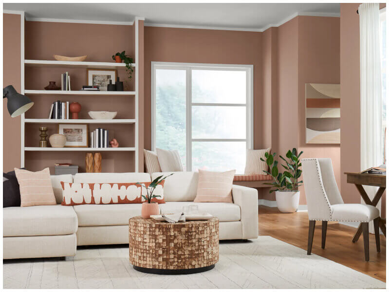
Decidedly the most neutral of the three, Renend Point SW 9081 feels more like an earthy terra cotta with a bit more pink. This gives it the versatility to play with more dramatic colors or allows a room to have a soft monochromatic feel that is both minimal yet cozy. Unlike the other colors this can also be a comforting backdrop, whereas the other colors can easily take center stage.
The rest of the color palette, Nexus, which we will share more of below, feature soft neutrals cascading from dark and light mushroom taupe to soft blush pinks and dove ivory. This color palette, being so neutral and versatile, could be used in almost any home style from traditional to organic modern. The following color palettes are from Sherwin Williams based on current home trends and predictions. These 2023 color palettes are intended to emphasize “what is ours, who we are,” said Sue Wadden, Sherwin-Willams director of color marketing. “The four new palettes remind us of the connection to the earth beneath our feet, the enduring beauty of ancient practices, the warmth of true compassion, the daily joys that make our world so wonderful. Let’s start with Nexus!
NEXUS
We already mentioned this one earlier since Sherwin Williams color of the year also resides in this collection. The theme of Nexus is “our communal well-being.” These colors can remind us of “a quiet place of healing, a realm where the energy we give is returned to us tenfold, where the warmth of loving kindness reminds us of what it feels like to come home.”

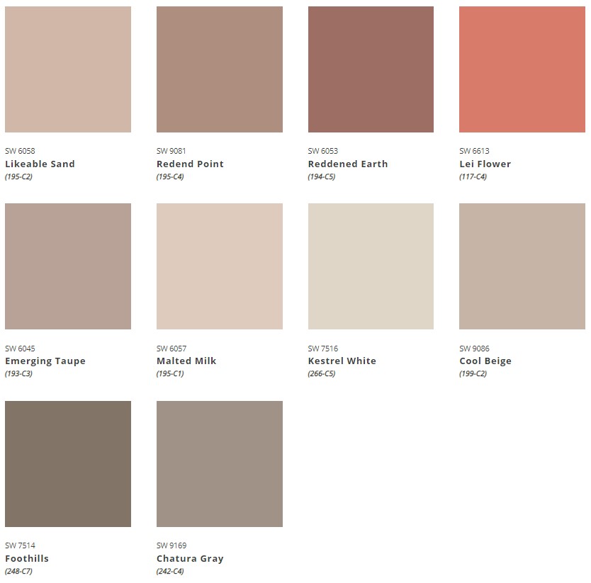
The colors of Nexus “enkindle a sense of support and serenity with a potter’s palette of natural clays and sunbaked desert sands.” They are Lei Flower, Reddened Earth, Redend Point, Likeable Sand, Kestrel White, Foothills, Chatura Gray, Cool Beige, Malted Milk, and Emerging Taupe. The influences for Nexus are human factors, having an energy center, the inclusion principal, and fostering community.


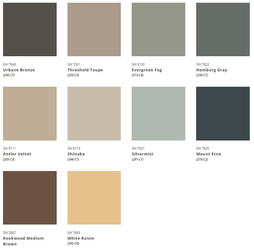
BIOME
The first palette introduced is called Biome—described as helping us “seek perfect balance with the existing, ever-changing ecosystem.” We can “preserve peace in an atmosphere of delicate mushroom taupe, lichen gray, rich earth tones, and the colors of our sky’s cloud canopy.”

Biome’s colors are: Urbane Bronze, Shiitake, Threshold Taupe, Antler Velvet, Redwood Medium Brown, Mount Etna, White Resin, Evergreen Fog, Hamburg Gray, and Silvermist. The inspirations are planthroposcene, a regenerative mindset, circular systems, and protopia.


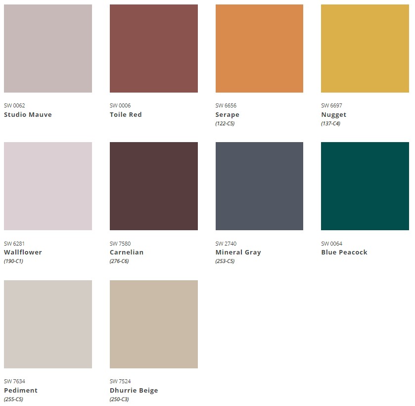
LORE
The Lore palette is inspired by “the call to create that is woven into the fiber of our being, present in the very air we breathe, binding us together in a community of makers that spans centuries and crosses cultures.” These colors urge us to “reconnect with an intricate mix of ancient reds, powdery pastels, and bevy of bejeweled tones—and embrace the transformative power of passionate creativity.” This palette embodies craftivism, old wisdom, and the passion economy.

Lore’s colors are Wallflower, Studio Mauve, Carnelian, Toile Red, Serape, Dhurrie Beige, Pediment, Mineral Gray, Blue Peacock, and Nugget.


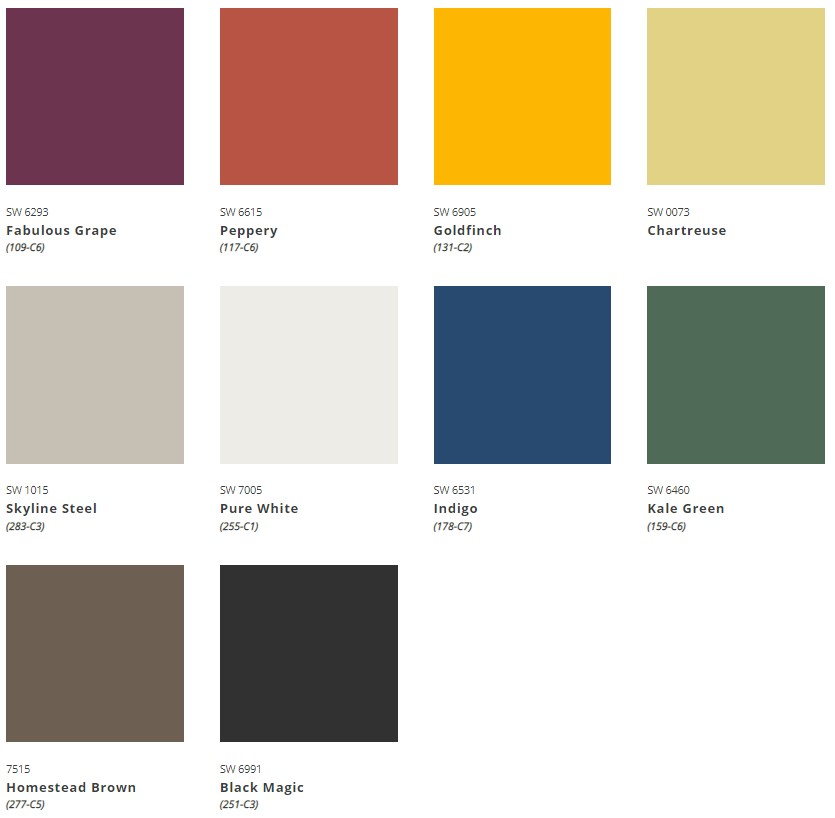
ORIGIN
The Origin palette is about “mapping our inner world.” The SW color team suggests that “to chart a path through the wild and wonderful landscape of our lives, we begin within. By layering our fondest memories and future hopes, we created vibrancy and joy in the present moment.”

Recharge with Origin’s colors that keep making a comeback—free-spirited brights, magnetic deeps, and a whisper of restful neutrals such as Fabulous Grape, Peppery, Goldfish, Chartreuse, Kale Green, Pure White, Skyline Steel, Homestead Brown, Black Magic, and Indigo. The influences are hybrid lifestyles, tech fatigue, a nostalgia effect, and “let’s go!”.


Does this mean grey and other cool tones are out? No, in fact many of the palettes above included blues, greens, and grays with the rich reds. This just means that we will have a refreshing amount of variety in the future of home design. Homes can use your favorite colors, and be as bold or as soft as you’d like them to be. From Viva Magenta, Raspberry Blush, and Renend Point to all of the variety in their complimentary palettes, there’s so much color to choose from! What do you think of the new color palettes? If you’re thinking about incorporating any of these fun hues give us a call at 865-392-6222 to get started!