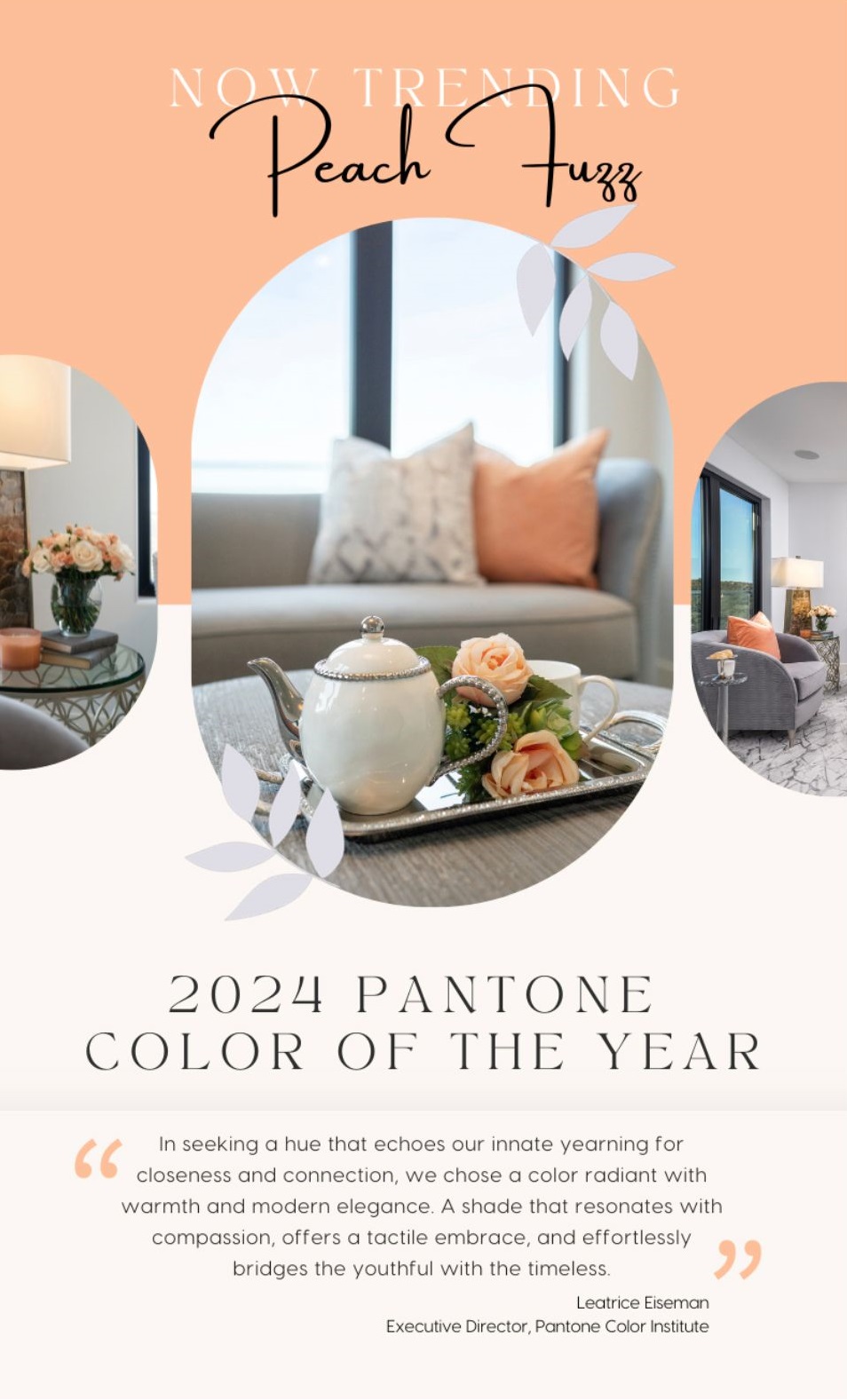
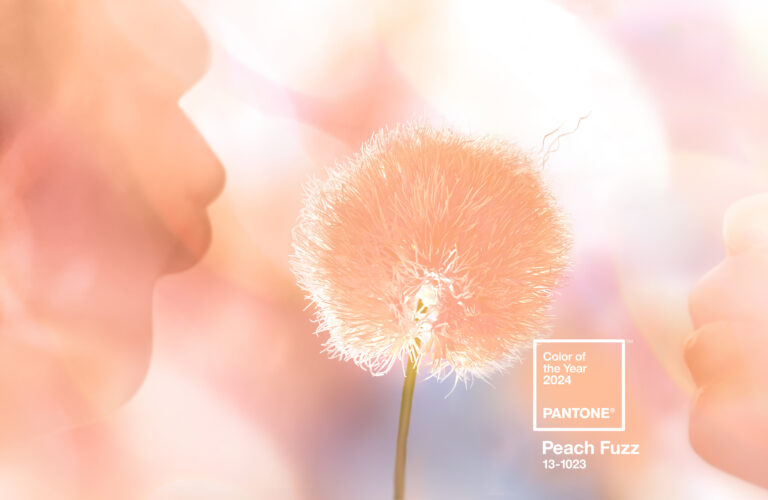
Ready the trumpet fanfare! The Pantone Color of the Year for 2024 is: Dah Dah Dah TaDaaahh. PEACH FUZZ. Yep, Peach Fuzz it is. Pantone 13—1023
“In seeking a hue that echoes our innate yearning for closeness and connection, we chose a color radiant with warmth and modern elegance. A shade that resonates with compassion, offers a tactile embrace, and effortlessly bridges the youthful with the timeless.” That’s from Leatrice Eiseman, executive director, Pantone Color Institute™
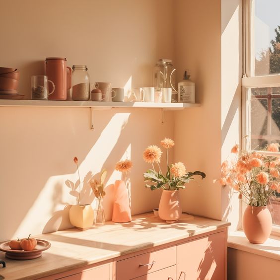
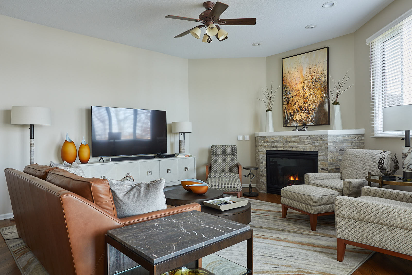
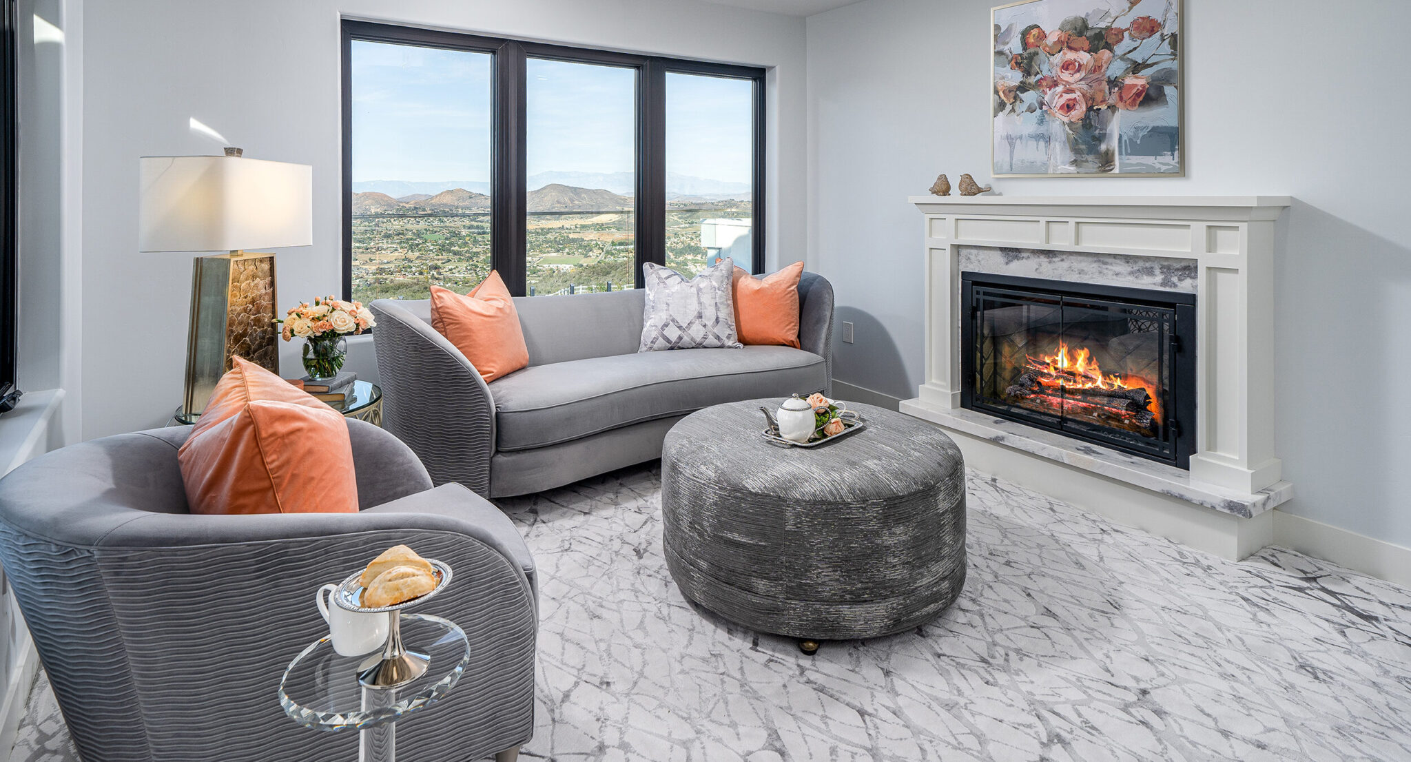
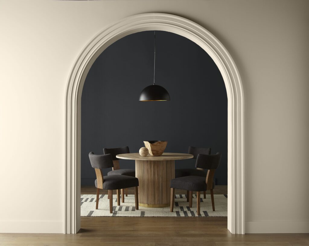
Peach Fuzz, claims the Pantone website, “captures our desire to nurture ourselves and others. It’s a velvety gentle peach tone whose all-embracing spirit enriches mind, body, and soul.” We already put together a pinterest board that encompases some inspiration for this color, as well as a room we’ve already designed that incorporated this hue! Click the image below to see more of this room.
While Pantone may be THE Color of the Year, each paint company selects their own, and all of these are also trend setting colors right now.
Blue Nova by Benjamin Moore “Violet and blue come together in this elevated, sumptuous hue.”
Persimmon by HGTV Home “This lightened-up terra cotta hue looks sorbet-like in sunny rooms, making it the ideal mix of earthy and vibrant.”
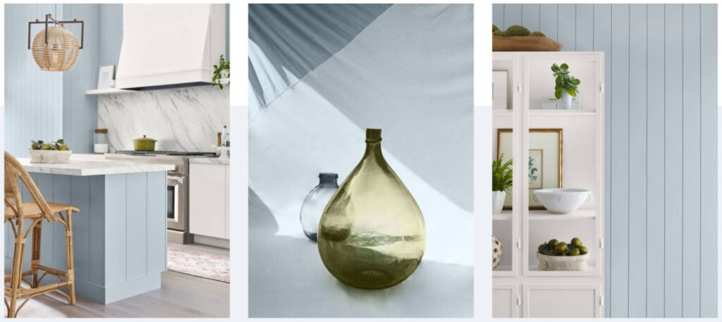
Upward by Sherwin Williams “Upward, a breezy, blissful blue. The color found when we slow down, take a breath, and allow the mind to clear.”
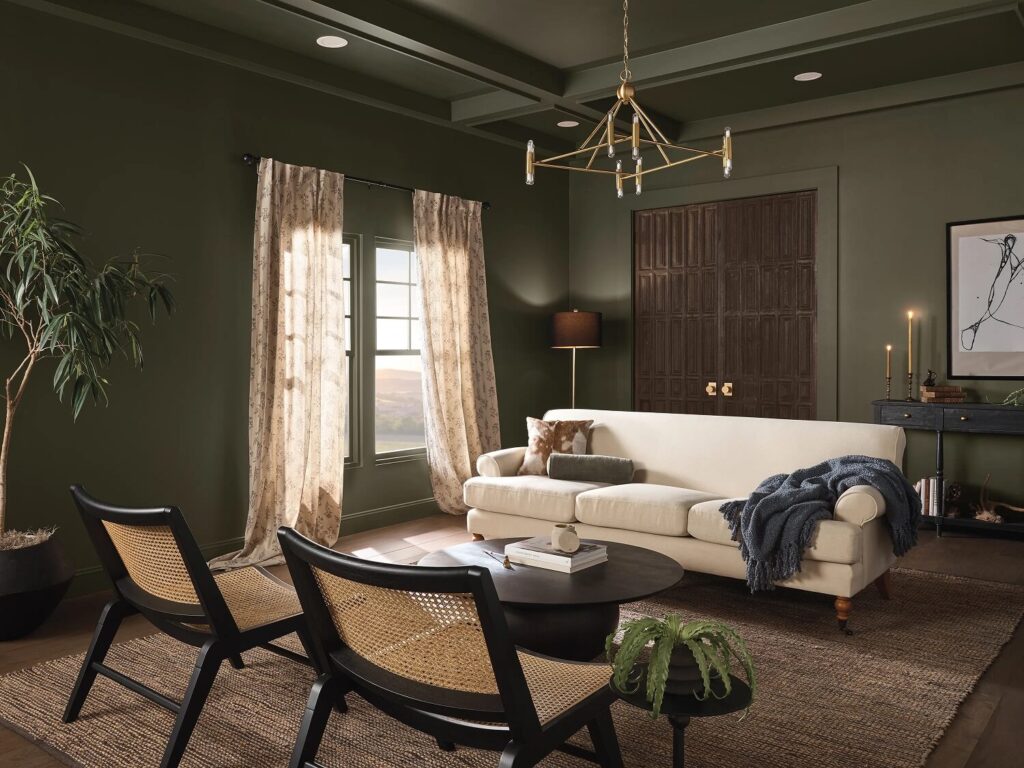
Ironside by Dutchboy “Ironside is the perfect backdrop for showcasing furniture, art and accessories. It brings an allover sense of sophisticated comfort.”
Renew Blue by Valspar “Inspired by fleeting elements like fog, mist, clouds, and glacier lakes, Renew Blue elevates the everyday mood, encourages self-expression, and evokes a feeling of balance and calm, with a twist of unique spontaneity.”
Limitless by Glidden “Limitless contains both the power of a primary color and the essence of a neutral to support both cool and warm tones. It even has the power to stand on its own. The possibilities are truly Limitless.”
Cracked Pepper by Behr
How did all this start anyway?
Voila! We found an article at ArchitecturalDigest.com titled Here’s How Color of the Year Mania Came to Be.
“In the 1957 romantic comedy Funny Face, Kay Thompson—playing a larger-than-life fashion editor inspired by Diana Vreeland–leads a musical number in which she marshals her staff (and presumably the world at large) to “think pink!” Bolts of Pepto Bismol–colored fabric unfurl across her carpeted office floor as she tells her junior editors to “bury the beige.” As it turns out, Funny Face was right on schedule. In real life, pink was all the rage, dousing everything from a 1957 Ford Thunderbird to a 1957 RCA Whirlpool electric range. The parallel underscored a uniquely 20th-century phenomenon—that colors themselves could have moments.”
Isn’t that funny since this is still the season of Barbie pink?
More from that article: “It can be tempting to think of color trends mere whim, or—when a trend really takes off—as a lucky stroke of creative genius. But as that other esteemed fictional fashion editor, Miranda Priestly in The Devil Wears Prada, famously
schooled her hapless assistant Andy, the colors of consumer products are never an accident. They are deliberately chosen, work their way through retail networks high and low, and end up tinting the wardrobes of even those who claim to be indifferent to fashion.”
The Pantone Color System has been the standard for color matching since 1963. In 1999, the Pantone Color Institute created the Pantone Color of the Year educational program to engage the design community and color enthusiasts around the world in a conversation around color. The Pantone website states: “We wanted to draw attention to the relationship between culture and color. We wanted to highlight to our audience how what is taking place in our global culture is expressed and reflected through the language of color. This thought process rings just as true today as it did back in 1999. That’s one of the major reasons why, each year, so many around the world look forward to our Pantone Color of the Year announcement.’
Pantone may not have been the first, though. Pratt & Lambert, a paint manufacturer geared to the interior-designer market, claims their program dates to 1996
In any case, how does all this help me?
First, it does stimulate some fun conversation and debate, even if it’s only about: How in the world do they come up with those names? Peach Fuzz? Seriously?
Second, it fosters creativity. Having a new color of the year, or 10 gives everyone something to look forward to, and is a fun way to notice trends in the design world from cars to interiors to fashion and even nail colors.
Third, it helps us the arts and design community communicate with the public and gives all of us a better way to share names and the emotions of color. Once you get away from the basic 8 colors it’s harder to describe the difference a soft and light green sage would have versus a dark bold hunter green. But by having these colors of the years everyone can see the impact and personality difference in all of the colors above and find new colors that represent them and what colors they resonate with, instead of just buying what they have seen on a showroom floor.
Color plays an important role in how interior decorating affects mental health. Color moves us. Color can set a mood and create a conversation. The website colorpsychology.org puts it this way: “It can excite or soothe your mood, raise or lower your blood pressure, even whet your appetite! Whether it’s innate or learned, it’s undeniable that color has a vital impact on how we go about our lives.”
So take your pick and make 2024 more colorful. And if you need help figuring out how to incorporate these colors into your home, give us a call today, and our team, Rachael and I will help you with your home.