It happens all the time. There’s a beautiful room photo online or in a magazine with the “perfect” paint color and you love it. You inquire what that paint color is and eagerly run off to get a swatch or a tester to paint on the wall, but once you do, you hate it in your room. Why did it look so great in that photo, but terrible in your home?

There’s many different possibilities, great photography with possible color adjustments, different lighting inside and out which can cause the most overlooked reason – metamerism. “Metamerism, in the context of color, refers to the phenomenon where two colors appear to match under one lighting condition but look different under another.” This happens a lot with interior lighting when there are different color temperatures of light bulbs and instances of clashing undertones with the paint color. This is often why when selecting colors in your closet, your outfit looks fine, but when you walk into the sunlight you might notice you’re actually wearing one black sock and one navy sock.
Below are a few examples of what we mean:

This photo shows the same paint color on the walls facing the same direction, at the same time of day, but the room on the left has 2700k lighting and the one on the right has 4000k. Both light bulbs give off the same amount of lumens of light. Which color temperature of light bulb to go with depends on the color scheme and function of the room as to which is better for the space.

This image shows two rooms, again with the same paint color. This time no interior lights are on in either room, but the color on the walls appear to be different based on the direction of the sunlight in each room. The foreground image has warmer south facing light, whereas the room in the middle has cooler north facing light.

This is an example of the same room, photographed with different color temperatures of lighting in the recessed can lighting. Note: Since this color palette uses white, greys, and blue the colors feel more true to color in the 4000k range. However if this room used beige and warmer reds it would feel green and dingy under that same lighting. Consider what colors are going into the space when selecting the color temperature of your light bulbs or select LEDs that can change their color temperature.
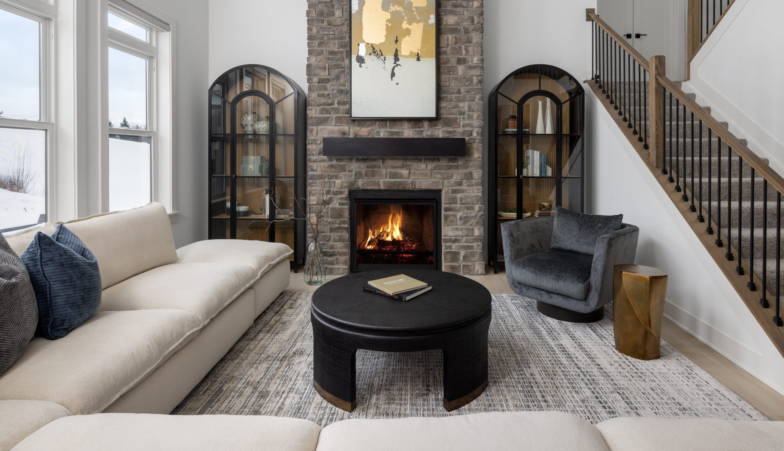
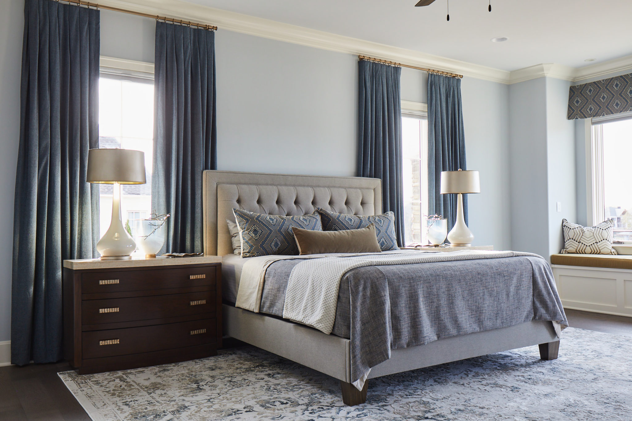
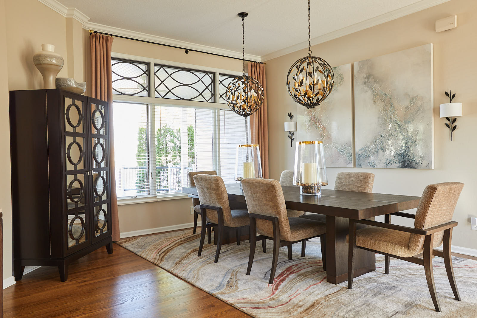
Believe it or not, even the direction your room faces, ie north, south, east, west, also affects the amount of light and the color temperature of the natural sunlight coming in from outside. A north facing room will receive the least amount of light and is cool leaning, whereas south facing rooms have warmer light. East is warm in the morning and cool in the evening, and west is cool in the morning and golden in the evening. These rooms will also experience “golden hour” at dawn and at sunset respectively. It’s also good to remember that paint colors that work great in a home in Florida might not feel the same in a home here in Knoxville. Got a large window in the room? What is outside it reflects into the room as well. For example, A room that has a lot of natural light filtered through trees will have a green cast to the room during the day. In addition, what is currently in the room will affect how the the paint colors appear. This is the case with a warm red oak floor against a cool blue wall or having a soft aged gray floor and a warm mustard accent color. All of these examples have a large affect to how a new color is perceived in a room.

When selecting colors for our clients, we consider all of the possibilities above. This is why we select paint colors last when designing an interior space. There’s thousands of paint colors, and there is the even the ability to custom mix a paint, so by selecting the wall color last, you can guarantee that you’re selecting the perfect paint color to compliment all of your fabrics and finishes. Without knowing all of the other components in a room, you risk selecting a paint color that doesn’t work, or reads a different color once painted on the walls potentially fighting or limiting your options for the rest of the project, and that can be a costly mistake! Overwhelmed or confused by paint color? Let us help you take the confusion or hesitation out of the way and work with you to create the perfect color palette. Give us a call or scan the qr code to get started today!